Browsing category Logos

From Sketch to Final: a look at the logo design process – Part 2


Blog 2 of 2 in a series

Horsepower Solutions is a organization providing EQUINE ASSISTED TEAM & LEADERSHIP TRAINING (Workplace Training). The equine assisted activities will be offered by my client to companies or corporations as part of their leadership and team training processes. Typically, the participants conduct an activity on the ground with the horses and then examine the patterns that emerge from the responses of the horses in the interaction, giving them kinesthetic learning. How individuals approach the activity carries back to the workplace in new awareness of, and change in, productive behaviors that enhance the bottom line.


"Kinesthetic learning, or tactile learning, is a learning style in which learning takes place by the students carrying out physical activities, rather than listening to a lecture or watching demonstrations."     – Wikipedia

Positioning Statement

The message strategy interview with the client uncovered the following aspects: communicate – lead – learn as you go, real time. Experience improvements immediately. Change how you react. Feedback in the moment. Shifts made to accomplish the deep work. Focus. Be better with your TEAM. Learn how to read people. Be aware of your actions. Discover communication holes.

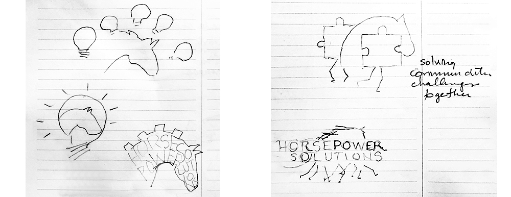
Here are a just a few of my concept sketches to incorporate some of those key words and ideas:


Below are several rendered concepts that I presented to the client:


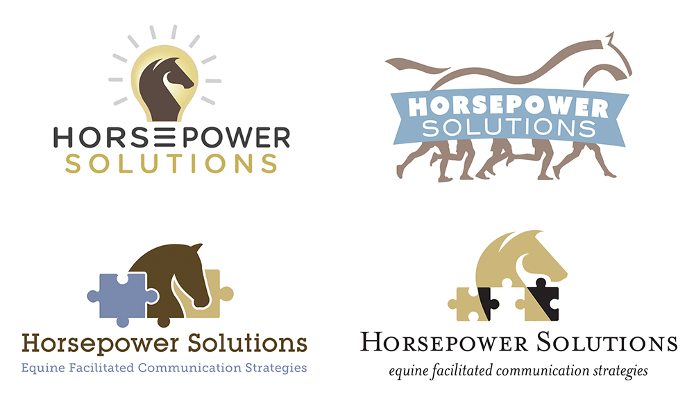
I had fun creating the “horse with the human legs” concept, but an unusual image is riskier when you need to appeal to the many ranks in the corporate world. In certain situations a clever/unique logo might just be the way to go.

For the final logo design, a combination of the two puzzle piece concepts was chosen. The client liked how the elements fit together and also liked that the horse’s head resembled a knight (chess piece) to signify team strategies.

From Sketch to Final: a look at the logo design process – Part 1


Blog 1 of 2 in a series

The Soaring Into Greatness brand was developed for a speaker and author who is totally blind and knows about light and dark. Many people allow their fears to stop them from experiencing life to the fullest. However, this is not the case with Gail Hamilton. As a result, she inspires and encourages her audiences… to live unstoppable, unforgettable, and unbelievable lives.

Positioning Statement

The client’s message strategy interview uncovered the following key words: soar; live; expand; love; joy; fly; passion; creator; empower; artist; music. To boost her speaking career, her logo needed to tell her story and impress those that would hire her to speak.

Concept Sketches

Here are some initial sketches that I chose to render more fully.

One secret about Gail’s compelling presentations is she unexpectedly breaks into song. She’s a talented vocalist as well as a powerful speaker. I was intent on creating visuals that were joyful, empowering, and included the elements of her life, such as her beloved service dog and music symbols.

Below are two of several logo concepts I presented to the client.


During the review of the concepts, I learned that the client wanted to emphasize freedom, and the flight to empowerment, and keep the singing as a surprise (shhh) — this meant not including musical elements in the graphic. After another round of exploration, the final design ended up being a combination of the two concepts shown above.

Final Logo Design

one moment at a time


Be Fully Alive is the brand name for a therapist who uses a holistic and mindfulness approach.
WileyDesign's goal: create an identity design for Be Fully Alive.
Using the information received from a Message Strategy meeting with the client, I created not only the logo design but the tagline: one moment at a time. The key word for the identity turned out to be “ALIVE.”  Vibrant colors, nature, art, and a sense of movement were important visuals for this brand.
Next step: make the website come alive, by creating a color scheme and selecting themed imagery to give the brand a consistent look.

Taking flight in the speaking realm


Recent Logo Designs

During the spring/summer of 2018 I had the pleasure of work with these 3 speakers developing their logo designs, business cards and other communication pieces. I have no doubt they will take flight delivering their inspiring messages.

Beyond the Horizon is a new brand for retired, long-time commercial airline pilot, Captain John Lind. He is now delivering keynote speeches and workshops sharing the valuable tools he learned in the cockpit: following the flight plan, how to be calm during distractions and emergencies, and more.

The Soaring Into Greatness brand was developed for Gail Hamilton, a blind woman with amazing stories of determination and success... and she'll surprise you with a special treat for your ears!

The Collaboration Effect brand was developed to highlight Mike Gregory's keynote speeches, where he elaborates on his very unique perspective of the value of collaboration in the business world, and in our personal lives.


[gallery size="full" columns="1" link="file" ids="988,979,980"]

Mile High Ingredients — Logo Design


Ingredients for Wellness

Mile High Ingredients is a 48 year-old company based in Denver. They are unique because they offer a wide array of ingredients for the active health and wellness markets. They have over 12,000 organic or natural products made from fruits, spices, vegetables, and herbs for use in food supplements, nutritional bars, sports beverages, snacks and more. They partner with companies like KIND (nutrition bars)—as an example, to provide custom ingredient solutions. WileyDesign designed their new logo, tagline, stationery, and marketing materials in collaboration with Six Degrees Studio. Mile High Ingredient's new website will be launching shortly. One of the benefits of working with different industries is learning so much about the back-end of a business... but that is another blog!    

Sleep Naturally…Wake Up Refreshed!


The Danican brand: simple, clean, with a timeless quality.
The Danican name is a contraction of the words Danish and American. They are a Danish-based producer and designer of innovative bed products since the year 2000. When they entered the American market in 2014, their existing product name was unavailable for registration in the US. WileyDesign was hired to design the logo for their new company name. The process involved a series of discussions and back-and-forth explorations with the client. Completing a message strategy questionnaire with the client in advance of the creative process is WileyDesign's standard protocol. Understanding their market differentiation and their potential customer is critical information to achieve a successful design. The red swooshes are symbolic of a sleeping figure. The result is an iconic word mark* that suggests comfort. To explore their bed products, visit Danican.com!         *A word mark is a combination of a graphic and/or stylized type that spells out the company name.