From Sketch to Final: a look at the logo design process – Part 1
Blog 1 of 2 in a series
The Soaring Into Greatness brand was developed for a speaker and author who is totally blind and knows about light and dark. Many people allow their fears to stop them from experiencing life to the fullest. However, this is not the case with Gail Hamilton. As a result, she inspires and encourages her audiences… to live unstoppable, unforgettable, and unbelievable lives.
Positioning Statement
The client’s message strategy interview uncovered the following key words: soar; live; expand; love; joy; fly; passion; creator; empower; artist; music. To boost her speaking career, her logo needed to tell her story and impress those that would hire her to speak.
Concept Sketches
Here are some initial sketches that I chose to render more fully.
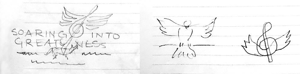
One secret about Gail’s compelling presentations is she unexpectedly breaks into song. She’s a talented vocalist as well as a powerful speaker. I was intent on creating visuals that were joyful, empowering, and included the elements of her life, such as her beloved service dog and music symbols.
Below are two of several logo concepts I presented to the client.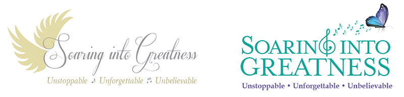
During the review of the concepts, I learned that the client wanted to emphasize freedom, and the flight to empowerment, and keep the singing as a surprise (shhh) — this meant not including musical elements in the graphic. After another round of exploration, the final design ended up being a combination of the two concepts shown above.
Final Logo Design
![]()

Comments are closed here.